UX Case Studies
UX Case Studies
SERP Analysis and UX
for Youth Support (Nonprofit)

Contact
Blog
Interactive Family Guide for The Discovery World
Role: Project Manager
Term: Fall 2024
Structure: Team of 4
Project Overview
This project aims to design an interactive digital family guide for adults visiting Discovery World with children. Accessible via a QR code at the museum entrance, the guide will generate personalized exhibit recommendations based on factors such as the children's ages, interests, and the time available for the visit.
The guide will create custom paths through the museum, providing tailored prompts, conversation starters, and contextual information that primarily support the adults in fostering deeper engagement for the children. By offering real-time support and insights, the guide will help families explore exhibits more meaningfully and interactively.
To further enrich the experience, the guide may incorporate a system of incentives that adults can give to children for completing tasks or engaging thoughtfully with specific exhibits. These rewards would serve to motivate participation and reinforce learning through fun and goal-oriented exploration.

User Persona
To ensure that our design aligns with the target group’s goals and needs, we created four user personas:
Two versions of grown-ups:
35-year-old female

42-year-old male

Two versions of young guests:
11-year-old girl

4-year-old boy

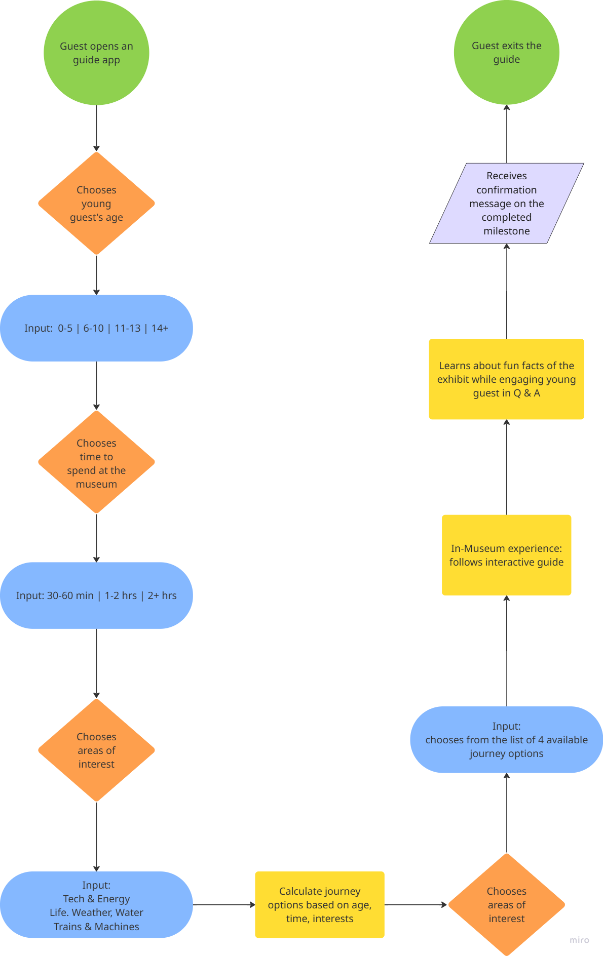
User Flow
Discover
We prepared research tools for three different participant groups and dedicated separate time slots to interview them.
Group 1:
We interviewed the Discovery World staff to see if they could share some insights on guest and exhibit interactions and their overall observations on guests’ behavioral patterns within the Discovery World space.
Group 2:
We surveyed weekday guests to learn about their overall experience at the museum and their interaction patterns with the exhibits, and also offered them a card-sorting activity to understand their recall and recognition patterns.
Group 3:
We offered survey questions and card-sorting activities to weekend guests as well because weekend families tend to have kids that represent a younger age group (0-5), which is also a vital part of our research data gathering.
Staff Interview Insights
-
Exhibits that are older are less likely to attract attention.
-
More complex interactive exhibits need more instruction and supervision for younger guests (simple machines, power on, Rockwell) and promote interaction.
-
Younger children avoid simulators and VR and can be scared by the lightning chamber.
-
“VR has a massive line … here are alternatives!”
-
Focusing on adding new value rather than highlighting the big-ticket exhibits.
-
Idea: “Feature/Exhibit of the Month”
Weekday Survey Insights
Qualitative:
“More toddler-friendly activities”
“We needed help figuring out the foam toys. The aquarium was my favorite.”
Low retention rate exhibits: “The Music History”
Quantitative:
Most Popular Engagements: Worked on activities together (60%)
Most Common Motivation for Choosing Exhibits: Fun and Engaging Topic (100%)
Most valued features: Hands-on (touching and feeling), Informative content (40%)
Takeaways:
Learning is always popular regardless of age or date/time.
Avoid Les Paul; steer younger children away from defined problem areas.
Touch and feel exhibits are as valuable as cranks and levers.
Weekend Survey Insights
Qualitative:
“Love this place, but I’d recommend you swap out existing exhibits more often. For a family that used to visit often, it’s too much repetition. The Maker Faire event was great! We don’t visit as much as we used to due to repetition. There used to be more things like science experiments and shows to change it up.”
“The exhibits we played with were very fun and interesting.”
“More projects will be enjoyable for the family.”
Why exhibits were enjoyable: “Interactive and relatable to the future.”
Quantitative:
Most Popular Engagements: Hands-on play, Solving Puzzles or Challenges (77.8%)
Most Common Motivation for Choosing Exhibits: Child interest (55.6%)
Suggested Improvements: More Interactive Elements, Additional Fun Facts (33.3%)
Takeaways:
Promote interactive, challenging exhibits that force guests to think more than normal.
Highlight/create content beyond typically popular exhibits.
Build guides around interest areas.
Card Sort Takeaways
-
Group by subject area (physics, water, transport).
-
Keep water exhibits together.
-
Provide context for ambiguous titles.

Define
The museum’s entry/starting point navigation isn’t straightforward for everyone, and grown-ups never know what experience is suitable for their child’s age. We need to design an interface that will give users the flexibility to choose their own journey based on the age group, time requirements, and area of interest.
Presently, the engagement with exhibits is missing context, and to overcome this gap, trivia games with a reward system and set milestones will be introduced.

Crazy Eights


Fun Facts
While the guests make their stops at each of the exhibits, they learn something new about it through fun facts.


Develop
Our team collaborated on crazy eights (wireframes) and a high-fidelity prototype based on the identified user flow and personas.
Prototyping
The guest's journey starts with identifying the young visitor's age group and the time they are planning to stay in the museum.


We recognize that some of the station names require clearer language and more references, so it was incorporated into our flow samples.


While the system is calculating their journey, the guest sees the progress indicator, which reassures them that there's no interruption in the process.
The journey options are calculated and what's left to do is make the selection.


Confirmation Message
After the guests completed their journey, the confirmation message that they see shows encouragement and provides the summary of what has been covered during their visit.


Deliver
Our team presented the completed project to the Discovery World stakeholders and shared with them the final report and the code of the final prototype.
To showcase our entire process, we created a 36"W x 30"H poster:


Key Takeaways
This project served as a valuable experience for every team member. And I personally learned how different views on problems at hand could mean returning to the basics and finding the common ground, resulting in more solid and refined design decisions that contributed to our growth as designers and natural collaborators.
Because of the time constraints, we relied on the MVP (minimal viable product) principle, ensuring that short-term goals were met in a timely manner and each deliverable contained its core requirement of which we could build further.
If we had had more time, we would have incorporated usability testing into our design process, iterating and improving the design based on user insights and feedback.
Additionally, we would have included more exhibit examples that the guests could meaningfully interact with, learning about each museum experience in a fun and engaging way.