
Blog
Role: UX Designer and Researcher
Term: Spring 2024
Individual Project
Project Overview
Traditionally students have been congregating at the college cafeteria during lunchtime, however, there hasn’t been any formal outlet or solution for neurodiverse student segments. These are the students who require more autonomy between the classes and can consume food normally only in smaller, quieter, and more secluded spaces.
The main objective of this project is to develop a user-centered solution to enhance students' experience on campus and bring more convenience and flexibility in how they consume their food, with accessibility in mind.
The solution should be simple and intuitive to navigate, allowing students to order food online in a few simple steps and pick it up (well-packed) from the cafeteria.

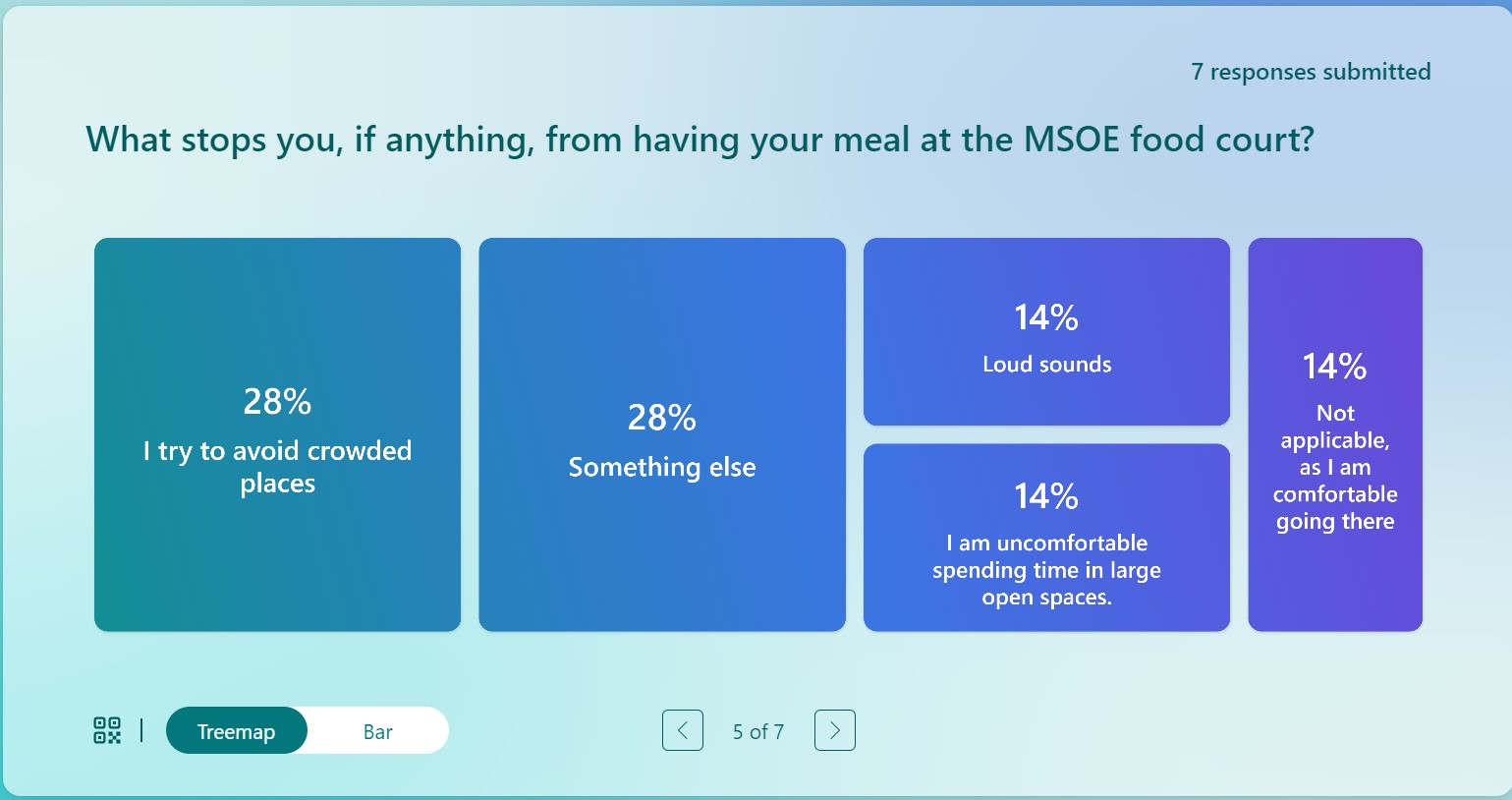
The initial survey showed at least one important insight about why some students struggle to have their meals in a public space.
The card sorting activity helped to identify what information should be prioritized on the main page and how it could be unfolded into the subcategories.
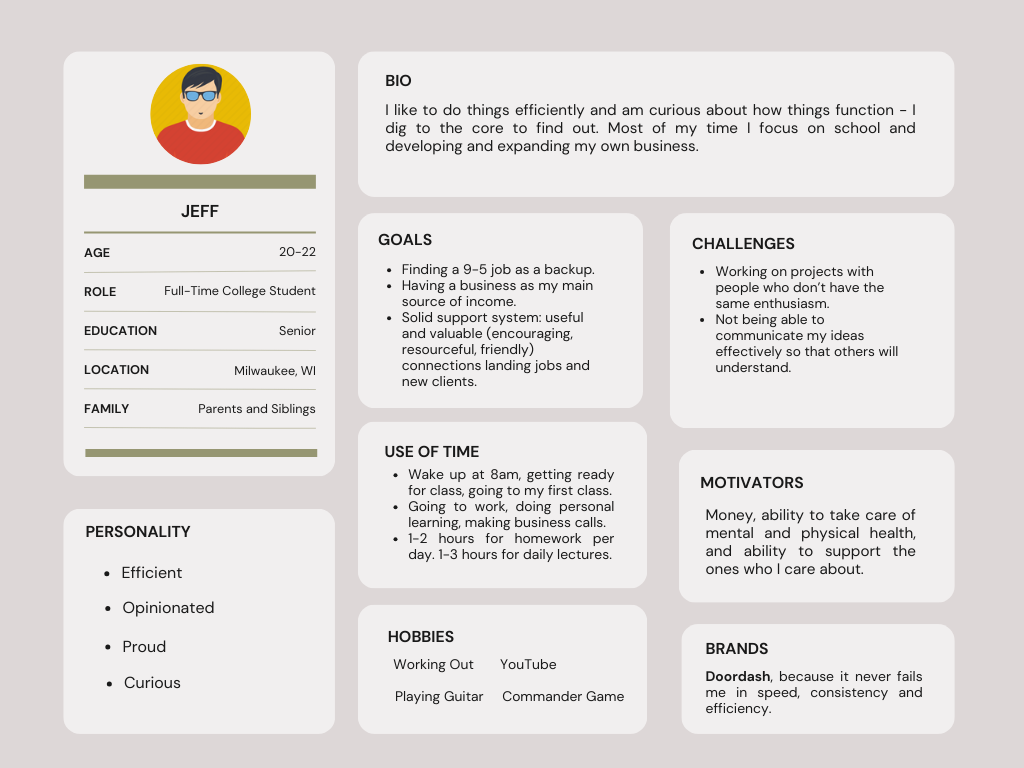
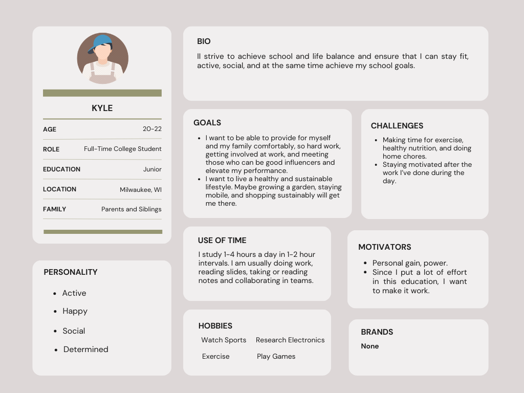
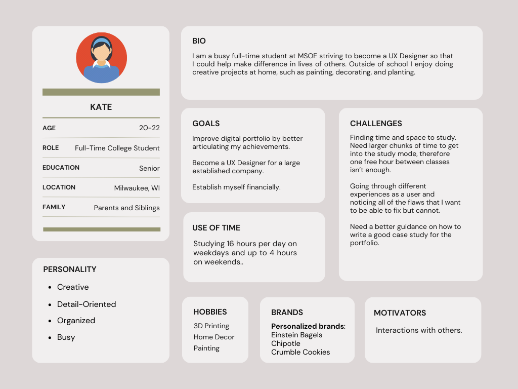
Based on the interview replies, I created four separate user personas with their unique lifestyle, needs, goals, and pain points, yet, representatives of a larger MSOE segment:
Inspired by the user personas, I created a student journey map (that could be further diversified).
Discover
To better understand users’ needs and their particular pain points, I applied three research methods:
-
Initial Survey: 7 students replied to the initial survey about the food-to-go idea.
-
Card Sorting: 5 students participated in the card-sorting activity
-
Interviews:
-
4 students replied to 12 interview questions:
-
2 from UX program
-
1 from Mechanical Engineering
-
1 from Civil Engineering
Research insights:

Student Persona:


Benchmarking:
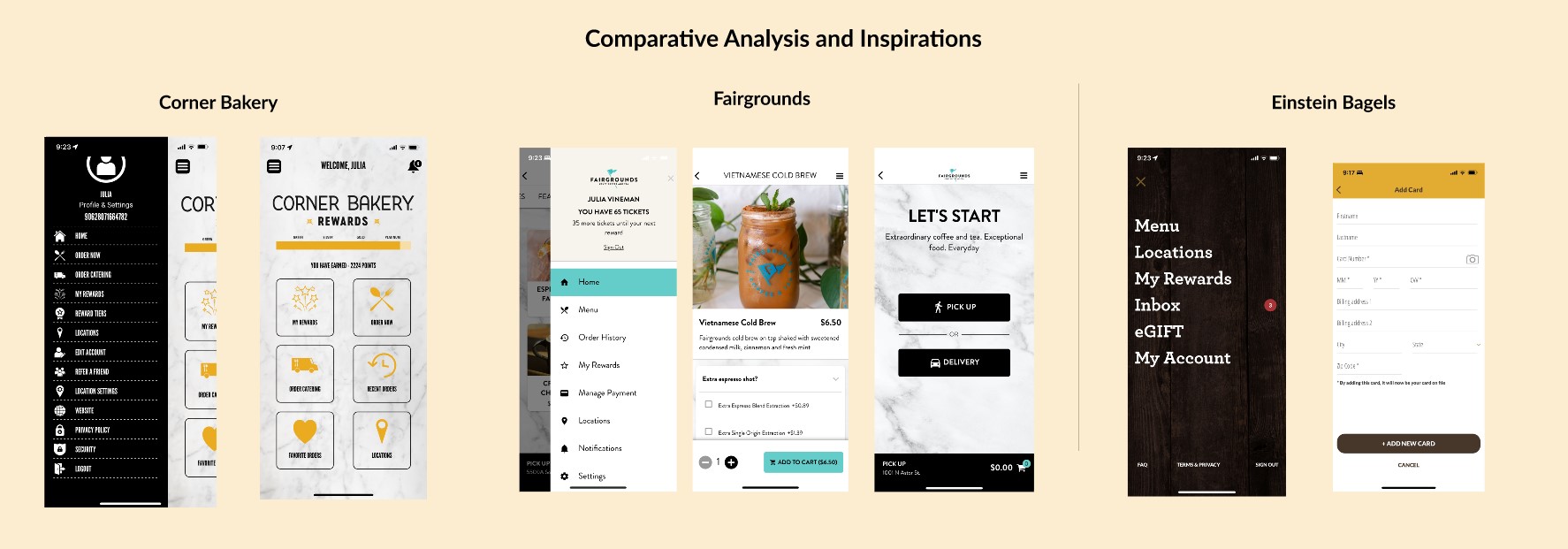
I’ve explored three different food applications that my interviewees were specifically fond of:
-
Fairgrounds
-
Einstein Bagels
-
Corner Bakery
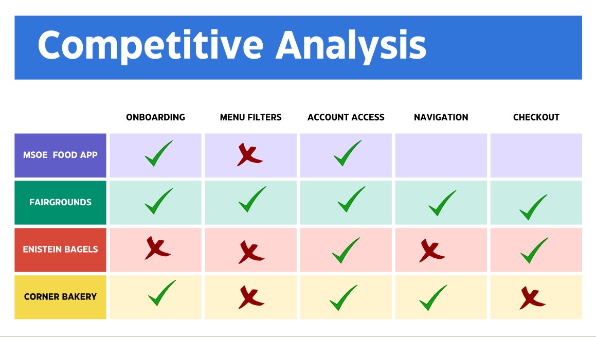
The competitive analysis table helped me to see what users appreciate the most about these interfaces, and what could be their source of frustration.
The most telling thing about the 3 of these applications is their onboarding. It creates the first impression, based on which the user will either have a delightful interaction, or a mediocre one.
Secondly, each of these applications has a unique approach to the hamburger menu.
Corner Bakery has a menu that is easy to recognize, and the icons next to each of the descriptions are relevant and helpful. The only weakness of this menu is that it is unreasonably long and could be condensed into smaller sections. t is somewhat difficult for eyes to capture the entire long list.
Fairgrounds has a better menu because it is slightly wider and includes the most basic and important categories. The icons are also very relevant and helpful.
Einstein Bagels chose to cover the entire screen with the menu in an attempt to give it a solid look, however, it does not feel well aligned with the company’s brand and its tone. It rather feels sturdy and solid and gives the impression of a simple list rather than a clickable menu. Another critical factor in those interfaces was navigational flexibility. When the user is able to modify their preferences and move through the stages swiftly, it makes them want to return.


Define
There is no system in place that offers such a degree of flexibility in the dining experience that the students can order their food through a secure online system and pick it up well-packed from the food court, supplied with utensils, napkins, bags, or any other needed sanitary supplies.
The only digital resources that are available to them are meals scheduled throughout the week, their ingredients, and nutritional value.
On a separate page that is not even linked to the cafeteria website directly, there is a page that describes all of the available meal plans. This information is unclickable and does not take the user anywhere further.


Password Reset: on the login page the user can request to reset their password in 5 simple steps. Click on “forgot password” -> request to send a recovery code to their email -> receive an email with the code -> enter the 6-digit code into the system, reset the password -> and re-login.

Develop
When I designed the onboarding for my prototype, I took the best and worst design practices into consideration based on the benchmarking activity and user feedback.
I ensured that the homepage itself includes the topics that the study participants in the card sorting activity indicated as important:
-
Today’s specials
-
Healthy choices
-
Order history
-
Meal plans


Empty State: when the user did not add any items to their shopping cart, it is important to inform them about it and give the flexibility to return to the menu so that they can add something to their cart.
Order Status: the vertical progress bar is suitable for the prolonged rectangular phone screen. It notifies the user at what stage their current order is, and these stages are easy to follow because they have multiple status indicators, such as color coherence between boxes, words, and labels, and additional icons on the utmost right in the form of completed and half-completed indicators.
Sliding Carousels: because the screen is narrow, I wanted to both: provide a range of menu options, and at the same time be space-mindful. The upper navigational bar is displayed in the form of a carousel and could be moved (dragged) left to right and right to left for more menu options. The navigation menu sections are also clickable and they take the user down to the chosen section on the long page.


Success Message: when the user places an order, they receive a success message on the next screen. It is hierarchically consistent and interactive, as it allows the user to further engage with the application by going to the dashboard and checking the status of their order when they click on the button: “My Dashboard”.
I designed this prototype with flexibility in mind, as the more control could be given to the user - the better their experience is. Whenever the user needs to sign out, this function is readily available in the footer which is always in the fixed mode. The user can move away from any of the pages to any desired section by visiting the hamburger menu bar, or simply going back to the main/landing page by clicking the MSOE icon at the center of the header.


Deliver
I designed the interactive prototype in Figma with four different flows so that stakeholders can try different scenarios and provide further feedback for each of the workflows:
-
Login or Reset Password
-
Add to Cart
-
Explore
-
Order a Meal
I created the design document so that stakeholders understand the reasons and rationale behind the design decisions.

Key Takeaways
This project demonstrated to me once again that there is always space and opportunity for usability improvements, and this process is iterative and flexible in stages.
Creating varied user personas helped me to get better insights into the pain points and intuitive workflows that, although might feel different for each separate user, overall are collective and unified in their basic human-centered requirements.